Verizon Investor Day 2022
Collaborating seamlessly with an exceptional fully remote team, I had the privilege of spearheading the creative direction and design strategy of the key visualizer for the Verizon Investor Day 2022 Conference. This endeavor was not just about visual aesthetics; it was a strategic initiative to align with the new Verizon brand colors and Ultra gradient while telling a compelling story about the disruptive force of the 5G Verizon Internet Gateway.
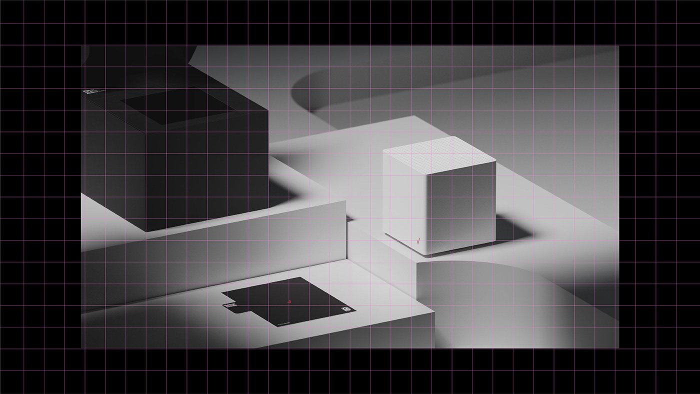
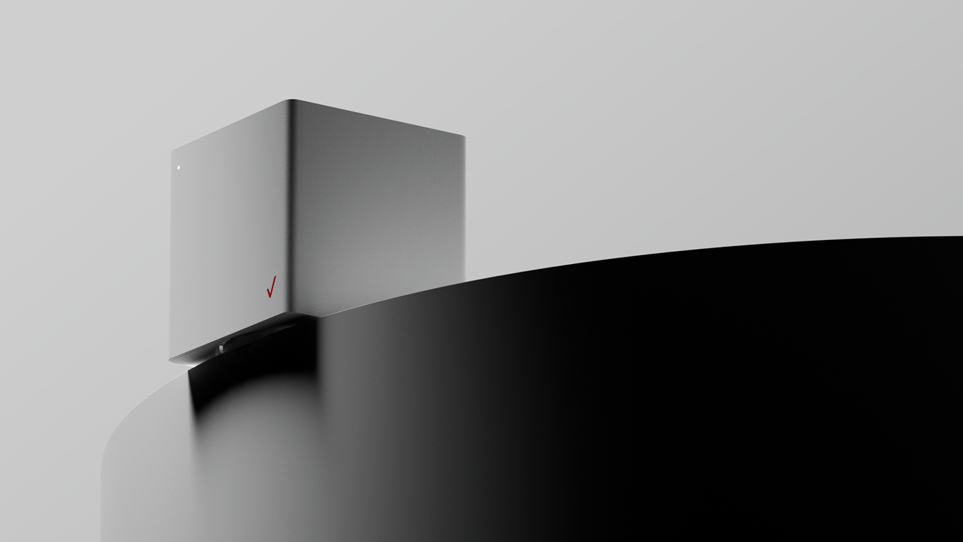
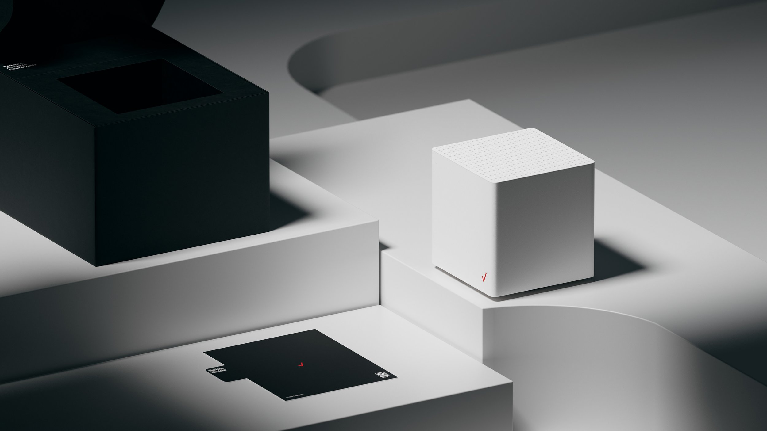
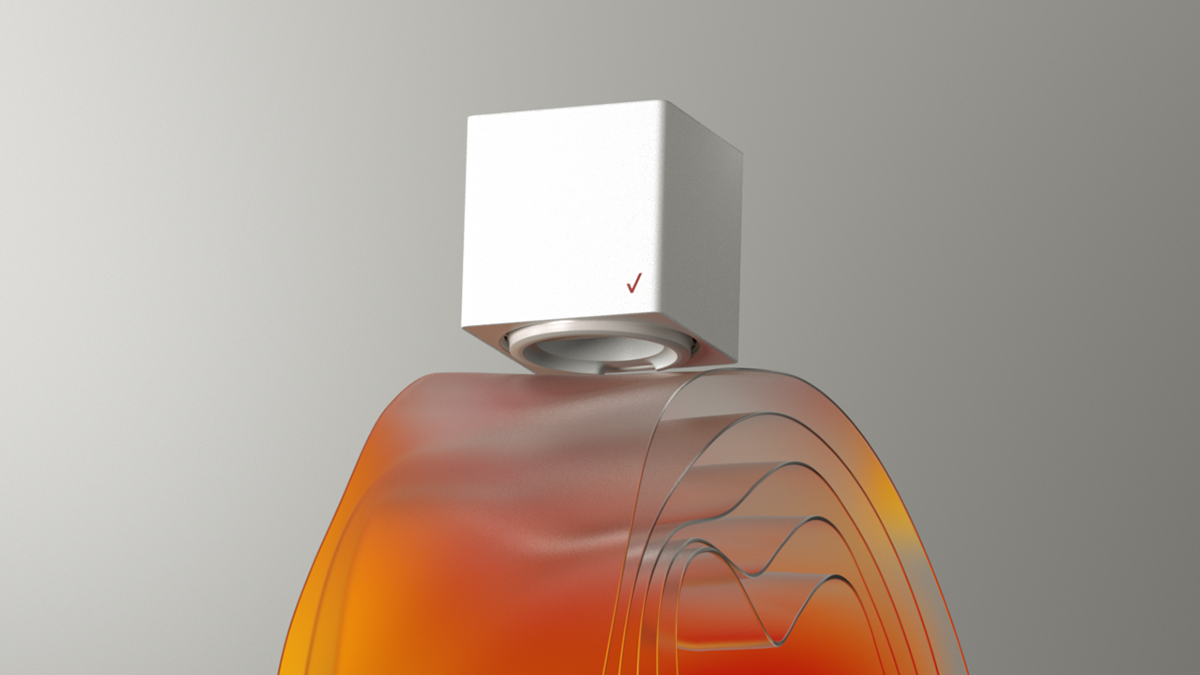
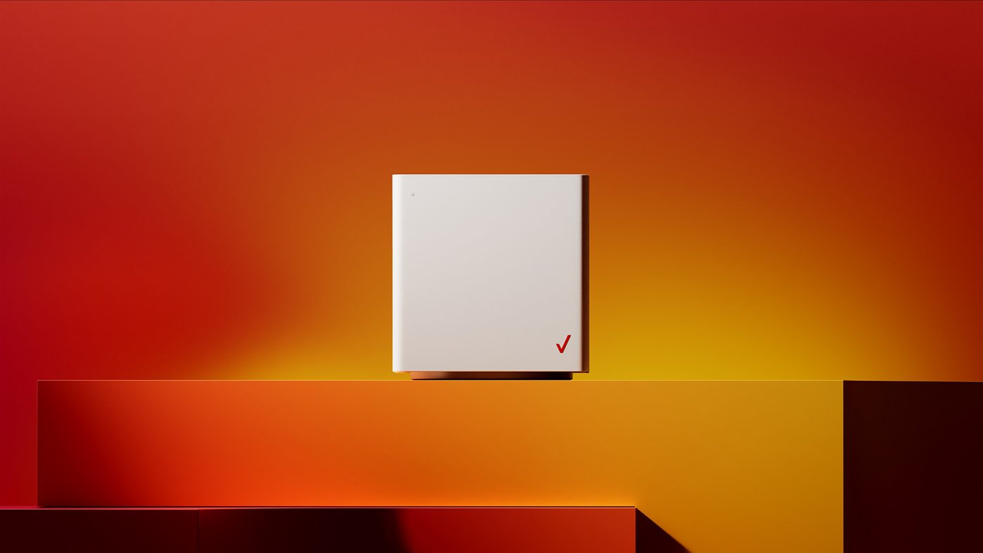
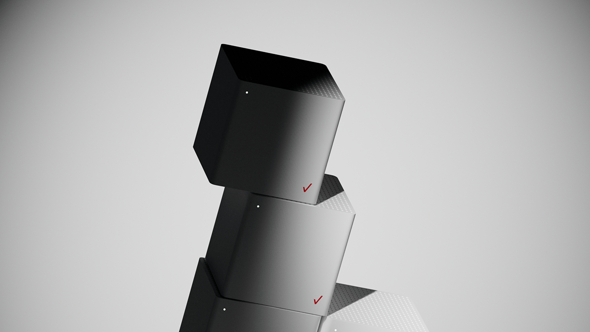
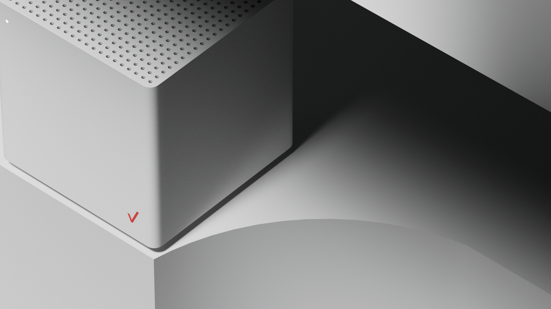
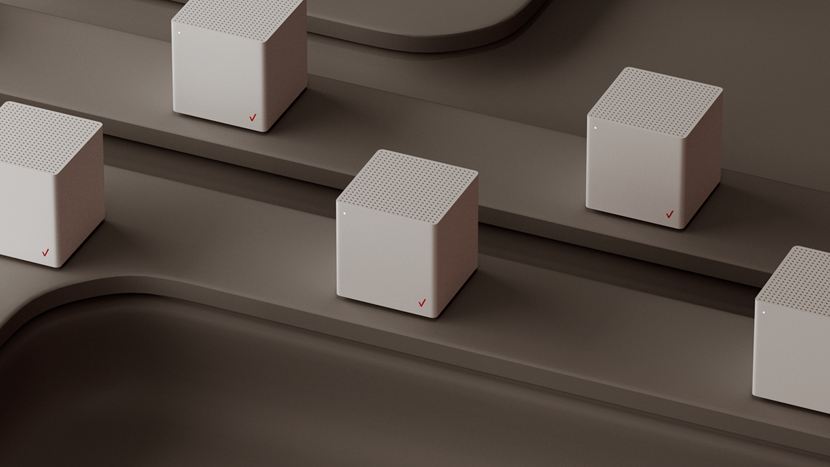
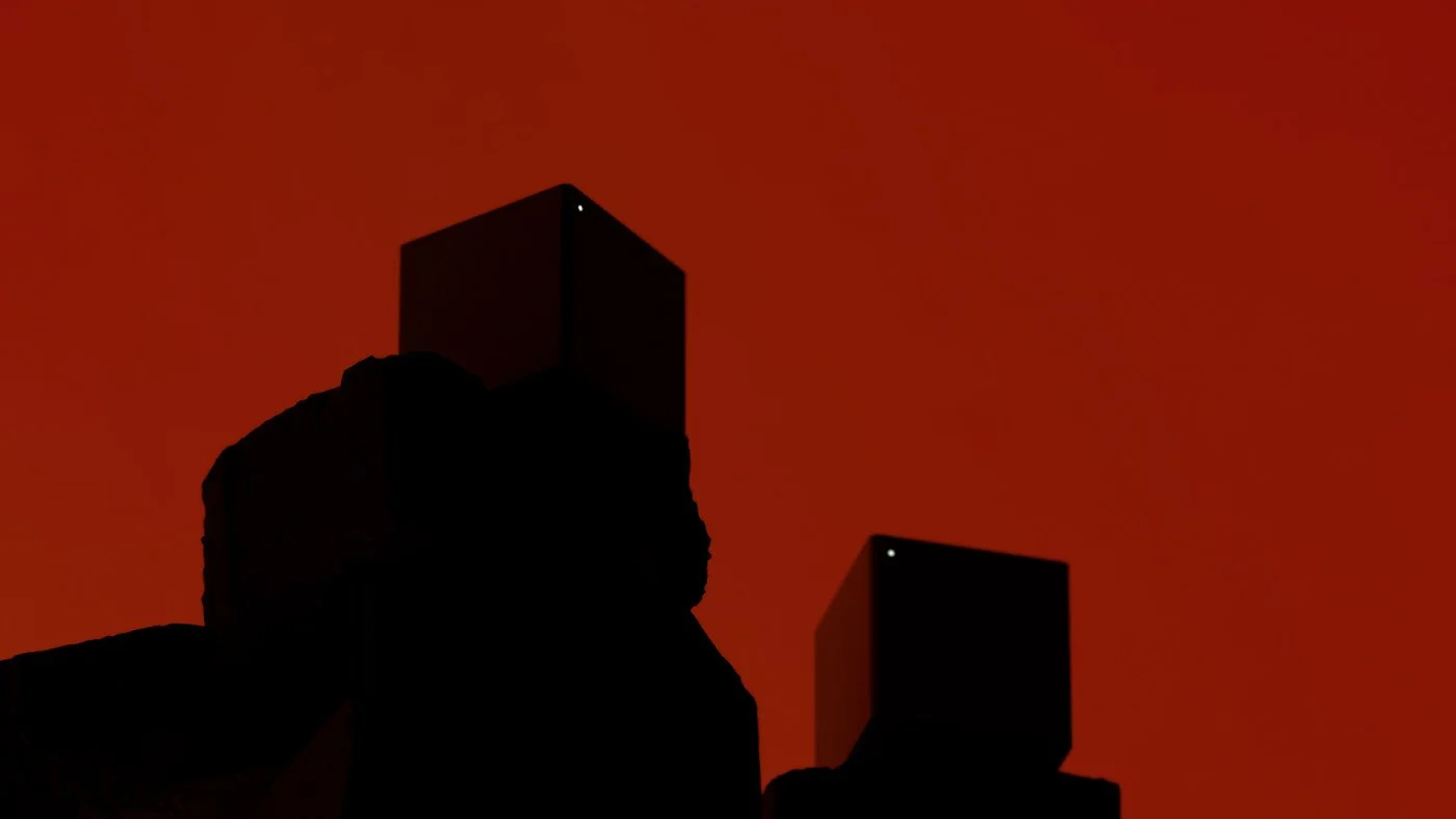
In the visual narrative, we carefully crafted a series of chapters that unfolded the narrative of Verizon's industry-disrupting impact. The progression, meticulously mapped in adherence to the brand's color scheme, seamlessly transitioned from nuanced greys to vibrant oranges and reds, enhancing the environment in which the product resides. This deliberate color evolution served not only as an aesthetic choice but also as a visual representation of the transformative power of Verizon's innovations.
Beyond the visual elements, supers and taglines were strategically employed to prescribe underlying motion and design, ensuring that the key visuals actively conveyed the dynamism and innovation central to Verizon's narrative.
Critical attention was dedicated to type, layout, and transitions, recognizing their pivotal role in maintaining maximum legibility during the conference's dynamic flow from one chapter to another. The result was not just a visually striking presentation but a carefully orchestrated and seamlessly executed visual storytelling experience that captivated and informed the audience at the Verizon Investor Day 2022 Conference.
This project stands as a testament to the power of collaboration, strategic design thinking, and remote teamwork in creating impactful visual experiences for major corporate events.
Creative Direction
•
Design Strategy
•
Typography
•
Creative Direction • Design Strategy • Typography •
A Visual Odyssey Through Gradients
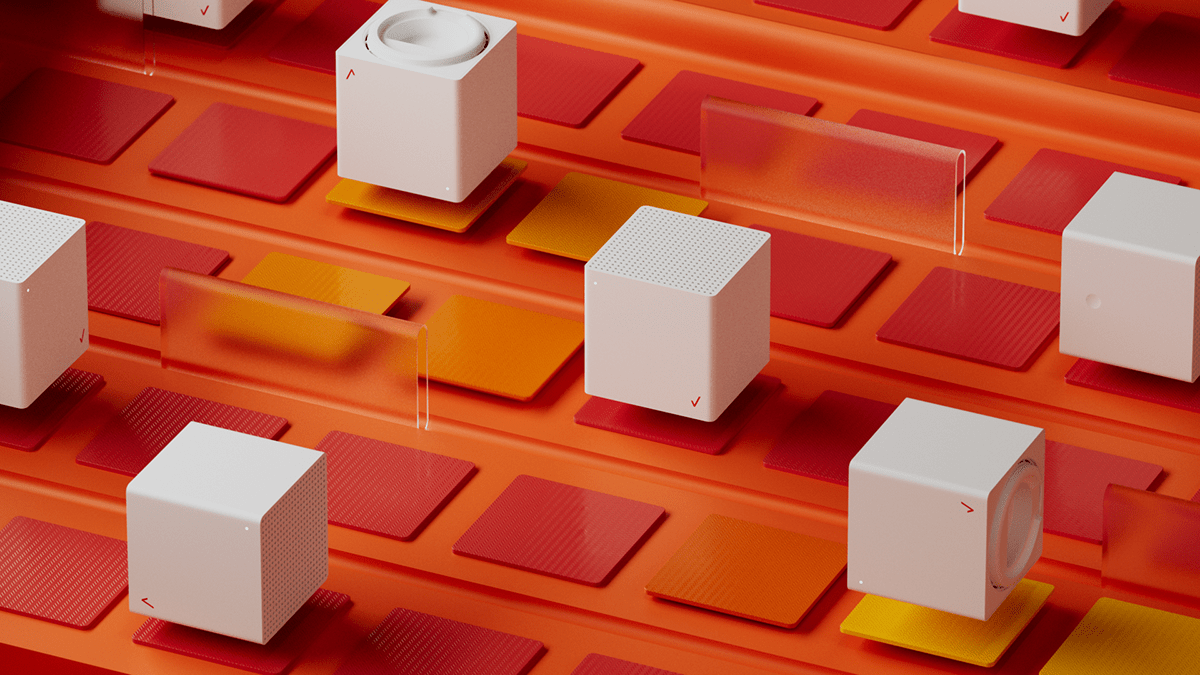
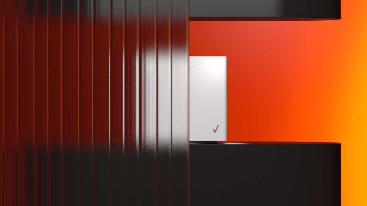
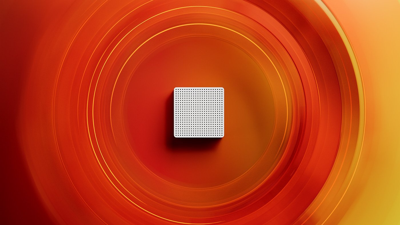
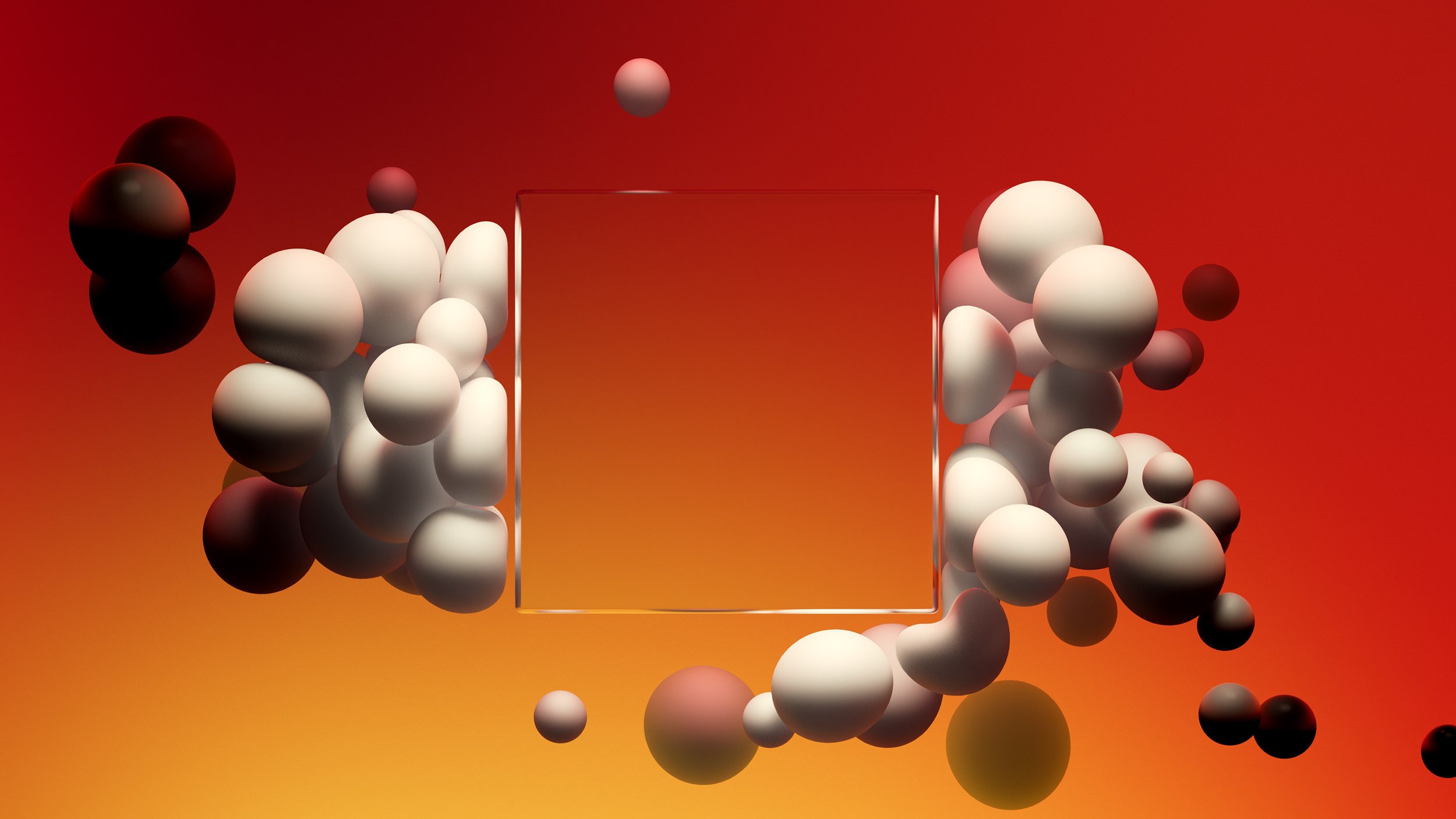
The Ultra Gradient is part of Verizon's new brand identity, and showcasing the spectrum from yellow to red was key throughout the film.
Design and motion were created with these colors in mind throughout.
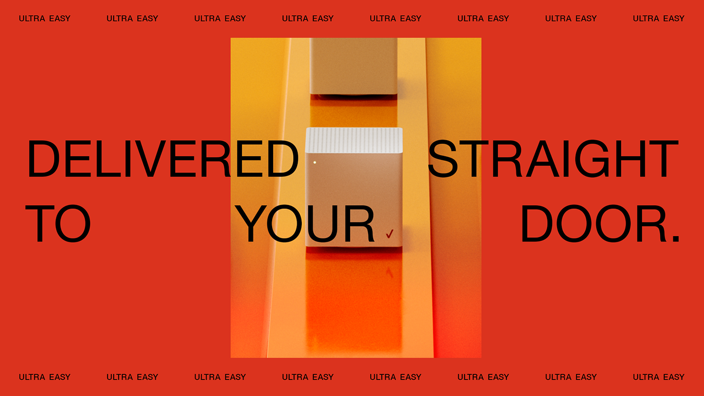
Below you will find design iterations for the different chapters throughout the film.





Design & Layout
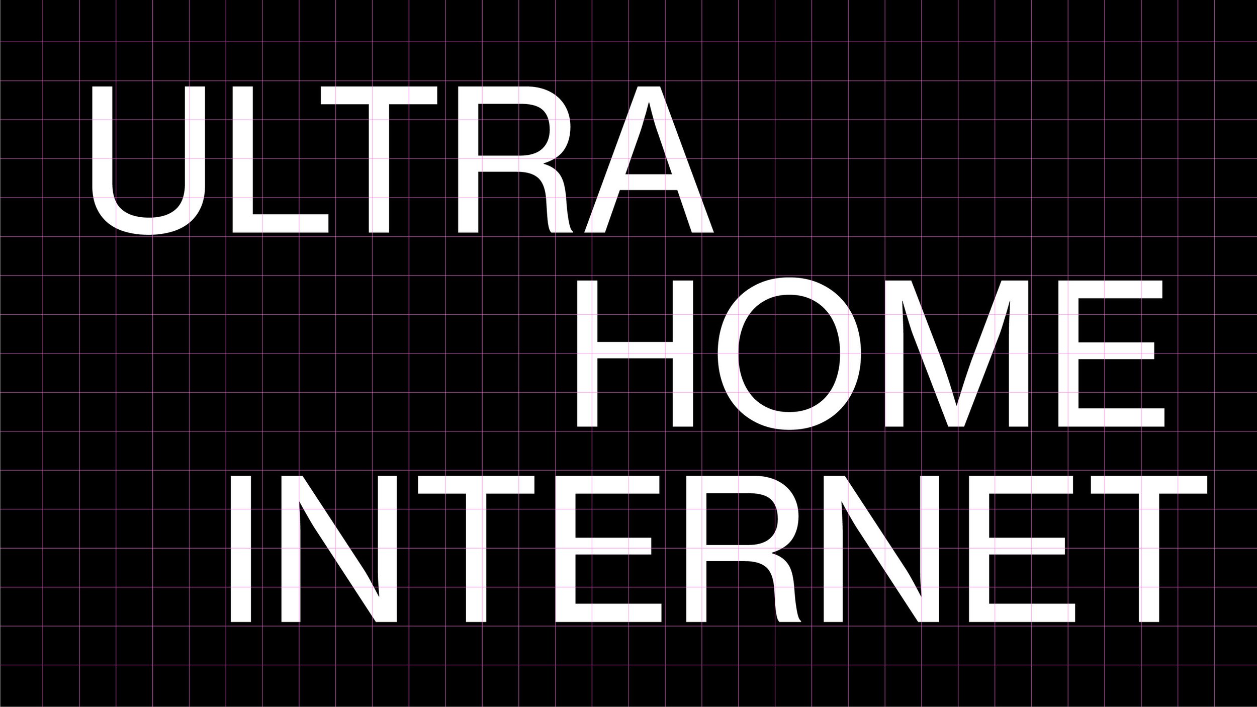
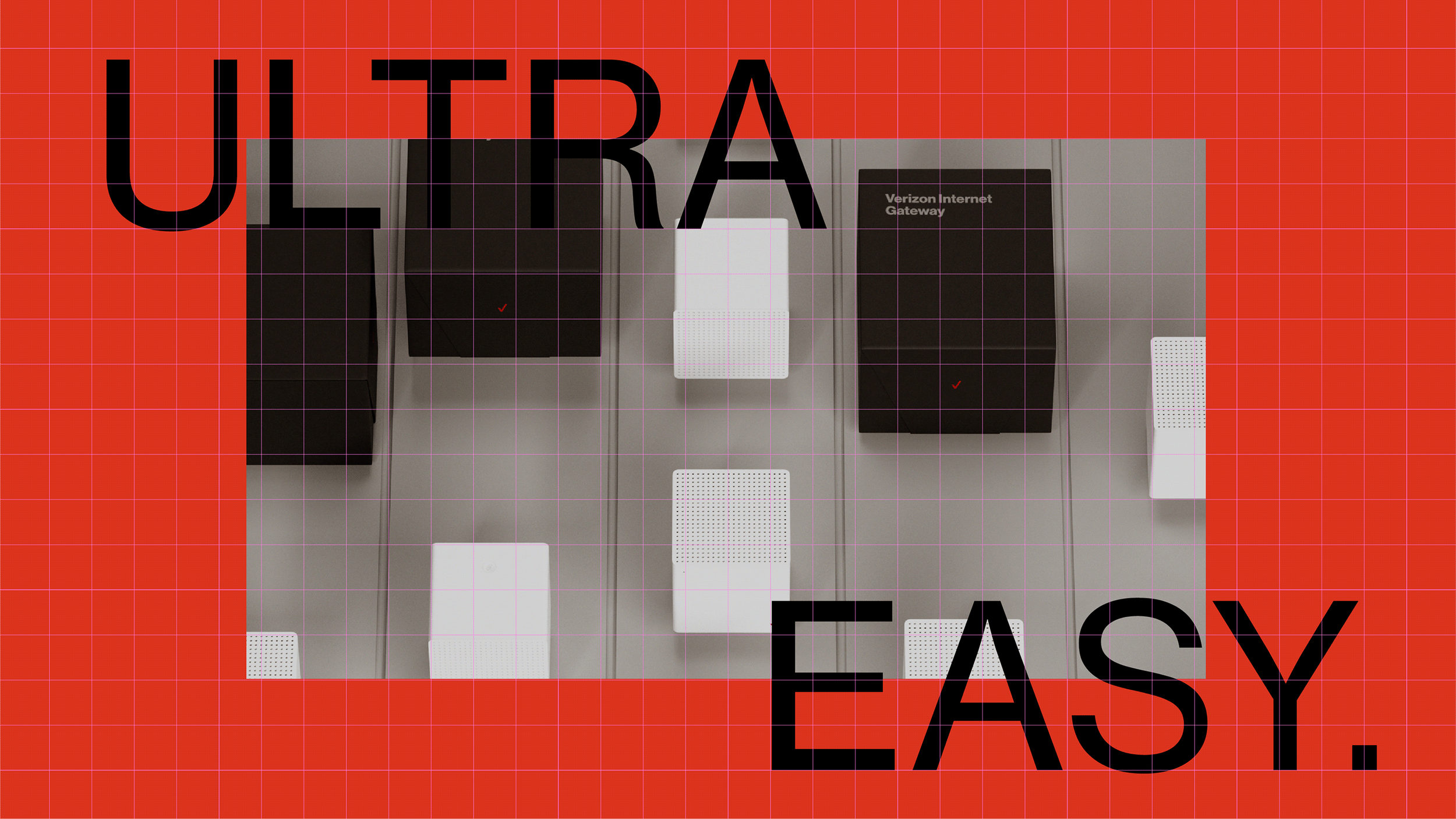
The execution of the type design and layout was critical to ensure maximum legibility for the presentation. The intention was to create an editorial feeling throughout, utilizing motion and type animation to transition from chapter to chapter in between supers and taglines.
Below are initial layouts, and type treatments.
